
Visual Identity Design
Complete visual identity design for Organizer Zero. For a decade Organizer Zero has quietly equipped parents - primarily Black and Brown mothers and grandmothers - to build and sustain their own grassroots organizations for educational justice.
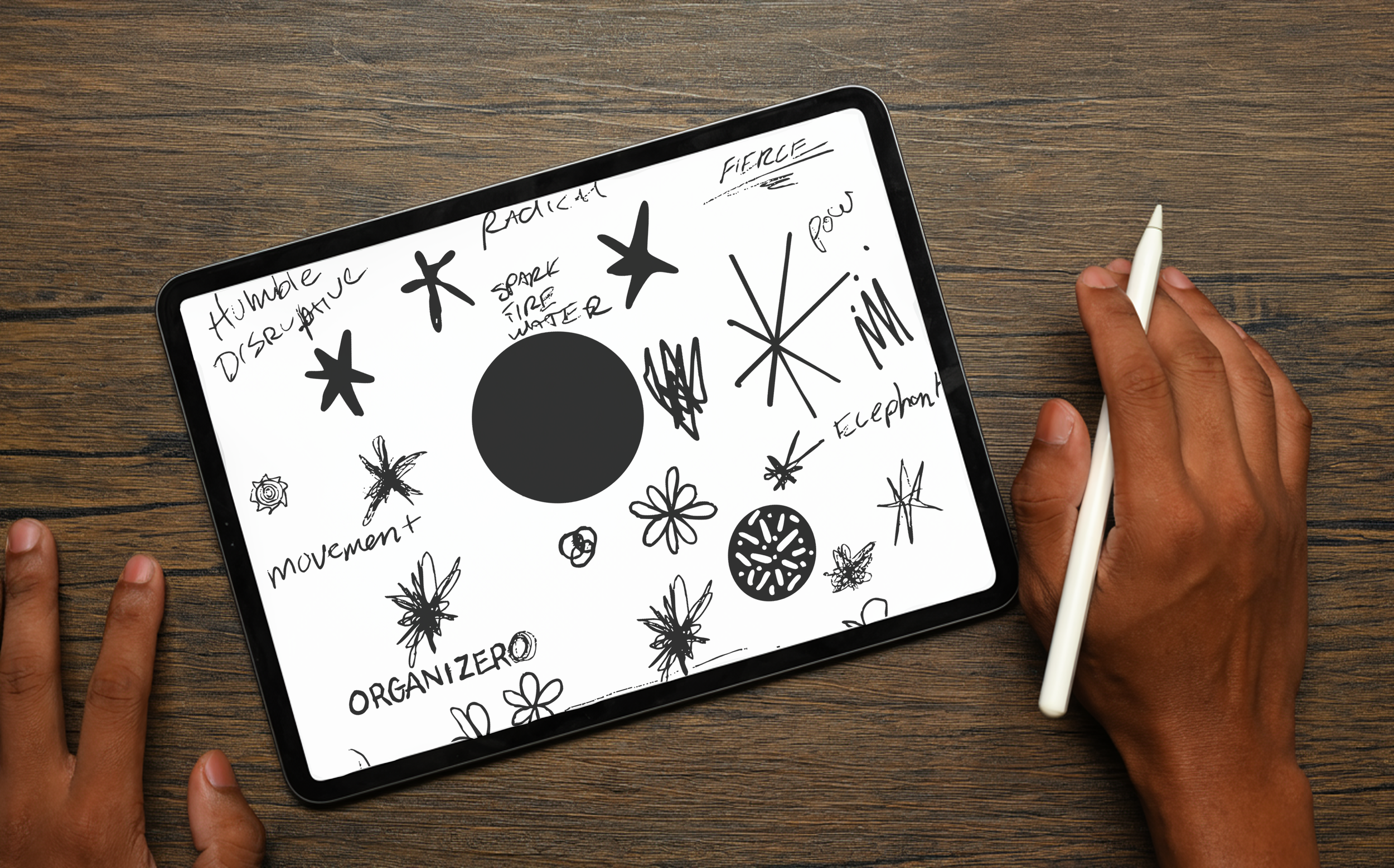
Through a series of discovery sessions led by The Shearer Group with Organizer Zero’s founders, advisors, and parent leaders, we uncovered recurring themes that define the organization’s core identity — shared humanity, radical honesty, and unapologetic power.


our APPROACH
Discovery Rooted in Relationship: We led one-on-one and small-group conversations to surface the values, imagery, and tone that truly represent Organizer Zero.
Design with Movement in Mind: We crafted a bold, dynamic brand system - a logo, color palette, and typography - that evokes energy, action, and connection.
A Visual Language of Power and Care: Drawing inspiration from grassroots protest art and cultural design icons like Paula Scher, we created an identity that feels both revolutionary and modern - an emblem of collective strength.
Practical Tools for Impact: Delivered a full brand kit, including templates for communications and storytelling assets that empower Organizer Zero to build trust with funders and community partners alike.


WHY IT MATTERS
Organizer Zero’s new brand marks the first time this decade-old movement has stepped fully into the light. It honors their radical beginnings while giving them the presence, polish, and visibility to further expand their impact coast to coast.
The result isn’t just a logo - it’s a declaration.With this new identity, Organizer Zero can engage funders, connect organizers across the country, and transform the system from the inside out.